
Your own components library with Storybook
About Chemistry-UI


🖼 Cover image by Marta XimenisCampins
🖥 Check a demo of the catalogue
Some context
Some years ago I was working on a new cool project with React and Node.js. The architect 👨🏽💻who was leading the project had the great idea to create a React Components Library 📚 that could be reused in different projects. Our client wanted to do a series of new front end implementations of some web apps 💻, so that solution would probably save a lot of time and help maintain coherence in all its apps design 🖍.
I decided that I wanted to do a side project with a similar approach, as I truly believe that this paradigm is very useful in modern web development and it has a lot of potential to lift a lot of burdens from Designers 📐, Front-End Developers 🖱, Product Managers 📈 and Users 🙋🏻♀️.
My library would be shared by web apps with different needs and styles and would let me share common components 🧩 as per example submit buttons. I decided to name it Chemistry-UI because it’s based on Material-UI Library by Google, it follows the Atomic Design principles (more about that some lines below) and because my wife is a chemist 🧪 and designed a beautiful logo for this project 🥰.
To achieve my objective I chose Storybook
Storybook is a tool that “forces” you to develop components that are correctly rendered in a “blank” UI context 📂 and that can be reused in different contexts of your apps or even in different apps 🔗! It also allows you to define “visual test cases”, called “stories” 📝, for your components, defining clearly the different states 🗂 a component can have (for example, a list with items, the same list with no items...).
This way of working made me develop complete demos for my components from the beginning while developing the Front-End, so I had to create a JSON with a fake example of expected data 📑 from the Back-End. That freed me from being blocked by dependencies with that part of the App. In other words, with Storybook, Front-End developers can just develop the visual UI without running the Back-End server 💽 at all until they need to test the whole app at the end of the feature development: Agile! 🤘🏿.
And, of course, the best effect Storybook has on your team is that it improves communication between different roles greatly 🤝. Designers 📐 can check the Storybook demo to look for already existing components that can be reused in a new template, Developers ⌨️ don't need to build the code or access production in order to see how the UI looks, Product Manager 📈 and QA 🕵🏼♀️ can see a component before it’s included in an already working template… and, of course, all of this translates in more quality 🌟 for your web app and your users 👩👩👦👦.
Some tips about Storybook
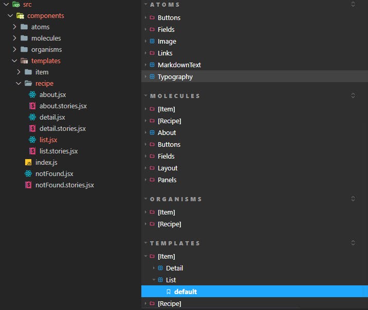
You’ll probably have a lot of different components in your library 📔, so it’s quite important to decide a good hierarchy from the beginning. An interesting paradigm is the one described in Atomic Design. Mine is based on that but I made some changes to make my life easier 😉: for example, if a component is only used once in a very concrete context like for example inside another component, I prefer to define it as a child of the container component tree node. And, of course, the “Pages” 📄 components are not defined in Chemistry-UI, but in the apps that use my library, as a “Page” is a “hydrated template”, or in other words, a template completed with the required backend data 💽.
It will make it easier to maintain the library if you have the same tree hierarchy in your project “src” folder 🗂 and in your Storybook stories.
If you have some component with RouterLink from “react-router-dom”; you’ll need to “trick” 🪄 React into thinking that you have a Router surrounding that component when you display it in Storybook to avoid issues. I use storybook-react-router in my stories for that 👍🏾.
You can customize a lot of things, like for example the order of your components list or you can choose to only display specific stories ✅.
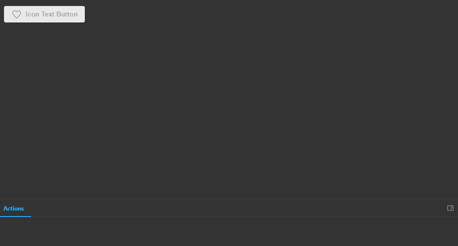
Storybook has a lot of useful addons that you can install. For example, “actions” lets you easily mock a button handler and log a message 📬 in a built-in console every time the button is pressed.
Some closing words
If you want to read some more technical argumentation 📋 about this project, you can check the project GitHub README!
Let me know in the comments if you want to learn more about Storybook, Material-UI or Components Libraries!