It's been some time 📅 since my last post, sorry about that; I was quite busy with life 😅.
This last week I have been working on my old project Barbarians, a little web-browser game 🎮. The UI is quite confusing and bad looking, so I wanted to try to improve that without expending too much effort on it 😎.
Some Context
This is a very simple web turn-based strategy game, so I want the project architecture to be simple too ⭐.
So, one of the biggest appeals ❤ of this project is that is done with very generic web tech: vanilla js, HTML and CSS.
It still uses jQuery for some old features (I know, I know... someday I'll remove it, someday 😏...) and even Bootstrap from the times before the CSS flexbox was created. The long-term goal is to remove them both. Over the years, js, HTML, and CSS have been greatly improved to the point that many old frameworks and libraries are not really needed anymore, at least for a simple project like this one 👍.
I think another advantage to keeping the number of dependencies small is that this project will grow old better 🍷: I cannot be sure that a library like jQuery will be periodically updated 5 years from now (at the time of writing this, the last update was version 3.6.0 on March 2nd, 2021), but I'm quite sure vanilla JS will not just still be strong 💪 but more powerful and with more useful in-build features.
So currently I'm focusing on improving the web page UI 🖥, as it really needs an update; and I will just improve the game's pixel art and animations in the future.
Tip 1: ❗ The warning
It's tempting to refactor ✂ too much code when dealing with an old codebase; it's important to try to remember to yourself which tasks give more value to the user, instead of losing too much time updating all the code just for the sake of it.
For me, using Github Project was the more effective solution. Every time I detect something that should be refactored, I apply the 2-minute rule. If that refactor takes longer to fix than that, I wrote it down as a card and put it on the TODO column and keep working on the current task I'm on, which I previously choose because of its value and urgency ✔.
Tip 2:🌈 Better use of colors
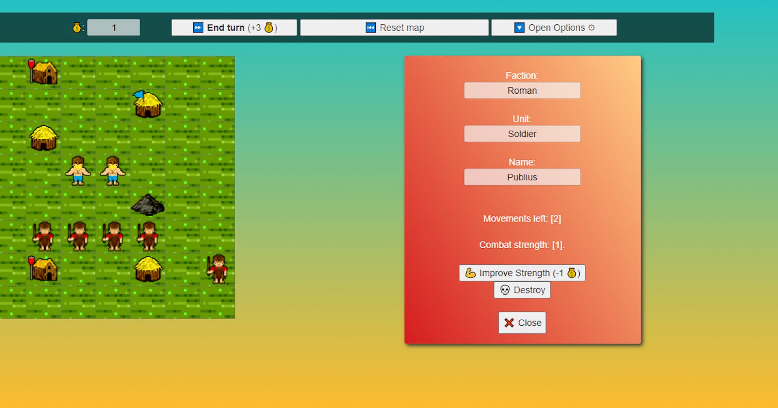
My original design used just plain colors as a background for the information panels. That was quite awful at the point I think it hurt your eyes 🙈, so I tried to improve it using some nice color gradients.
For achieving that, a quick solution was using this tool for auto-generating the CSS ⚙.
Then I had an idea: previously, if the user selected a Roman soldier or a Roman building, the background color was the same: the color of their faction. But with a gradient I can play around with color combinations and try to get a different background for each unit type and faction in the game, so color can give more subtle information to the user 🤓.
Also, I was using a real photograph as the page background, and I felt like it didn't really fit with the pixel-art and very colorful style of the game; so I just changed it for a gradient too 😅.
I'm not perfectly happy with the result, to be honest 😅, I think I should use more similar colors or maybe follow the Complementary Colors Theory; but I'm no designer yet, just a humble Frontend Developer.
Tip 3: 👩💻 Have your CSS rules under control
So as I explained at the beginning, I'm forbidding myself 🙅♀️ from using Sass or Less in this project, as much as I love them. This came of course with a lot of limitations: some of them I could workaround, as for example using CSS var() to create variables for colors so I could make sure the color-code was coherent in all the game's UI 💯.
But I couldn't find a solution for having a rule inside another rule in CSS, as it's so common to have on the CSS language extensions. To mitigate this, I divided my single CSS files into smaller files, classified in folders representing the different components they affect; so even if my CSS code is a bit duplicated, at least is easier to find what you are looking for 📂.
Tip 4: 🗃 The importance of order
I realized I had 2 different types of buttons scrambled in my topbar: the game's actions-related buttons like "End Turn"; and options buttons like "Mute Narration". As options buttons are not used as much as the others, I could just "hide" them in a toggleable panel so they won't confuse the user so much, and avoiding users clicking them by mistake 💫.
Tip 5: 🌞 Of course: add emojis!
I have a tendency to overuse emojis 🙄😉😓, and of course, a solid icon is quite more beautiful in a button than an OS-dependant emoji; but still, they are quite effective as a quick solution to improve your text readability, and using them doesn't really cost you anything, as they are just characters as any other letter 🔠.
👋 Some closure
You can play the new version here
